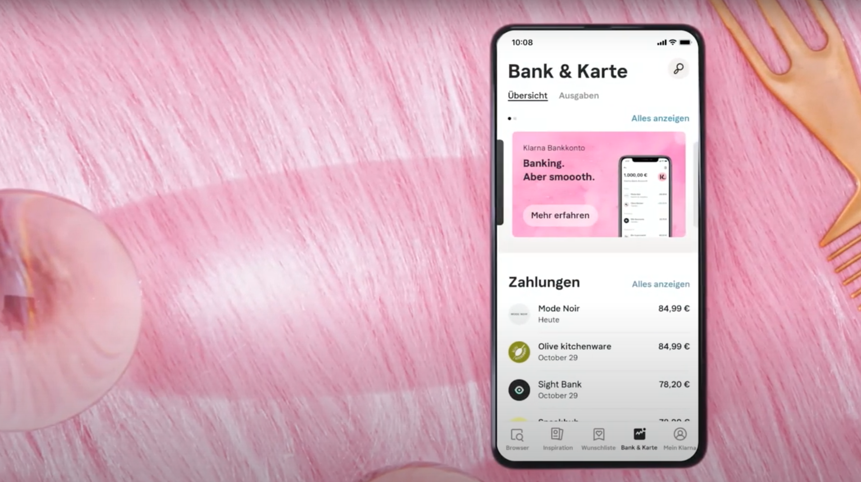
That Klarna would eventually offer its own current account has long been suspected. Brand, customer approach to UX, the prerequisites to deliver a true Challenger product are there. When Klarna let the cat out of the bag in November 2020, one or the other bank, whether neo or established, was certainly not happy about the new competition.
If Klarna did as good a job with current accounts as they do with payments, they would become a serious alternative. A real challenger bank with direct access to over 90 million Klarna customers worldwide and 6 million app users in Germany alone. Klarna makes no secret of the fact that it wants to compete with the established players: “There is still a lot of room for improvement in the way we currently manage our finances and save money. Users expect seamless, intuitive and transparent services to meet their daily needs. However, many traditional banks are not yet delivering on this.” says Klarna CEO Sebastian Siemiatkowski.
The Klarna current account has been available since 10 February. However, only in the form of an MVP (Minimum Viable Product) for a few selected, almost 10,000 Klarna customers. Both the range of functions and the first test show that banking lives up to the claim of an MVP. After all, it doesn’t get much more minimal than that.
Registration via Self-Service using KlarnaIdent (KYC procedure).
Registration is an absolute no-brainer for users of a Klarna card. In other words, onboarding happens so fast that it feels like you’re already not dealing with it enough. Those who can create an account on the side might just use it on the side. Of course, easy onboarding and KYC is a plus, but here one wonders if it ended up going too easy.
3-click transfers and instant charging.
That you can recharge the account is not so special. Revolut users laugh about it, you can top up the account there via Apple or Google Pay, Klarna (Sofort), bank transfer or deposited credit card. The situation is similar with bunq, for example. That you can now load the account at Klarna only via bank transfer is kind of sad. The fact that transfers work with “3 clicks” is not the greatest invention in online banking.
Smart Budgeting – Create monthly budgets
Users can create monthly budgets for themselves.
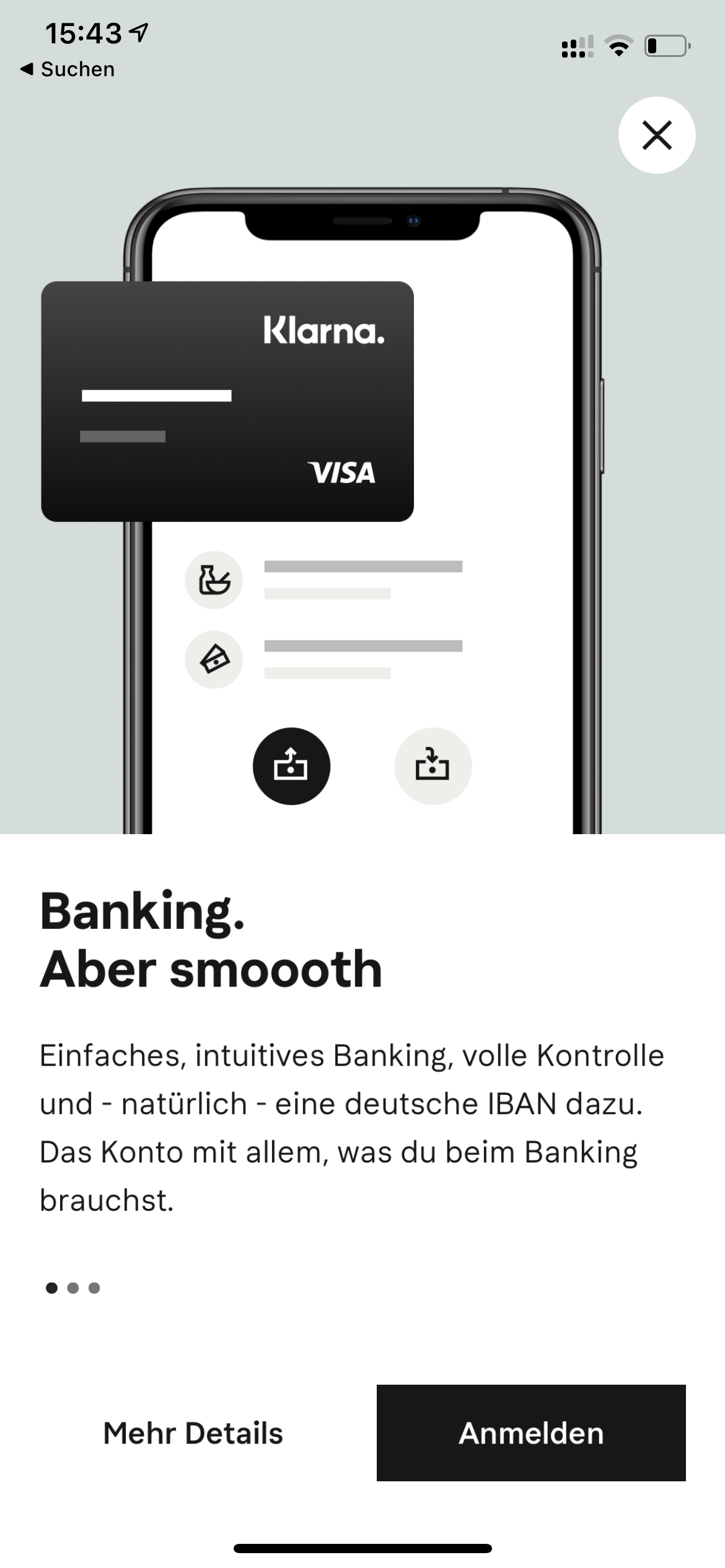
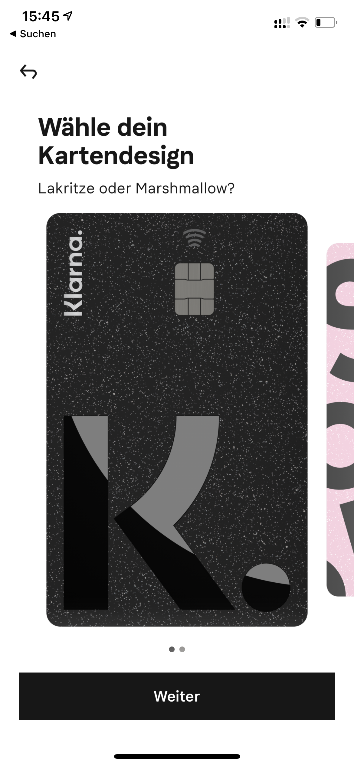
Klarna Bank Card – The account comes with a Visa debit card.
As a Klarna Card owner, this is – except for the new card design (eg licorice) pretty unspectacular. And that you get any card is obvious with a checking account. Without would be stupid too. The good news: you can also use your debit card for Apple and Google Pay.
Cash can be withdrawn at all ATMs – up to 2 times per month free of charge. Also abroad.
MVP or not, at least here Klarna could have been more innovative or at least stand out from the competition. It’s clear that cash is dying (slowly), but to advertise that you can only withdraw money for free twice a month seems unrealistic. N26 is in a better position. DKB customers anyway. With Revolut, you can withdraw 200 euros a month for free.
The card can be linked to both Apple Pay and Google Pay.
It just has nothing to do with the checking account. Users of the Klarna card have been able to do this for a long time. For new customers, this may be a point, but also nothing that you get by now at (almost) every bank.
Direct debit payments or bank transfers are possible for all 36 countries in the SEPA area.
Nothing out of the ordinary and kind of a shame to put it out there like that.
There are no costs for opening or maintaining an account.
Free account opening is not worth mentioning. Moreover, other banks pay for it when an account is opened there. A permanently free account is a plus point, here the exciting question arises where Klarna is going and what the business model will look like.
The Klarna account as a market test
Whether Klarna has done itself a favour by going out with such a really minimal range of functions is a matter of divided opinion. It really only makes sense if there’s something “big” still to come. What that is and where the journey can go, one can speculate at most.
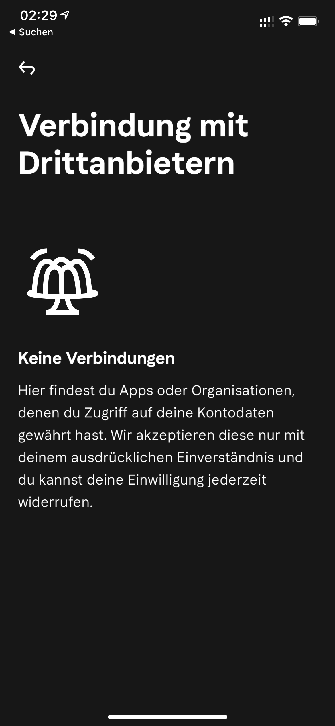
What is certain is that a kind of app store for banking is planned. There is a first hint for this in the app. Klarna has also designed banking not as a singular app or product, but as an integral part of the Klarna shopping app, because that’s what it is, a shopping app. And shopping can include a new cell phone plan, or a new insurance policy. In contrast to pure transactions via the Klarna Card, these can be identified in banking. It’s quite possible that Klarna is trying to go down the same path that large tech companies have always been suspected of: Reading the account data, deriving recommendations from it or making it accessible to third parties via the banking app store via the XS2A / PSD2 interface, after the users have given their consent.
Conclusion: uninspiring or deceptive appearance?
Being notified of bookings via push may have been a standout feature five years ago. Also that one the support 24/7 is attainable, may be nice, comes as a rule however rarely. And that the app can be biometrically protected via FaceID or TouchId is somehow not worth mentioning. Perhaps it also just fits in with the big investment round that Klarna is aiming for. Of course, stories like this can be worth their weight in gold in the truest sense of the word.
Or it’s completely different and Klarna is planning something much bigger. The first free checking account that analyzes sales data to make recommendations itself or offer a banking appstore to third parties.
Either way, whether the strategy of linking a checking account so closely to shopping is a good idea is something Klarna needs to prove. This is literally a hop or top game. If it remains more or less simple banking without added value, Klarna will have a hard time. If you want to be put on the waiting list, you can do so here.
